Section Branding
Header Content
COVID-19 Data From Georgia’s Health Department Could Be ‘Misleading,’ Experts Say
Primary Content

Public health and data experts have raised concerns about the clarity of some COVID-19 data published by the Georgia Department of Public Health less than a week after Gov. Brian Kemp decided not to extend the shelter in place order for most state residents.
Following the update of its website last week, some experts say the changes represent a better attempt by officials to show coronavirus trends a little more than two months after the state confirmed its first cases.
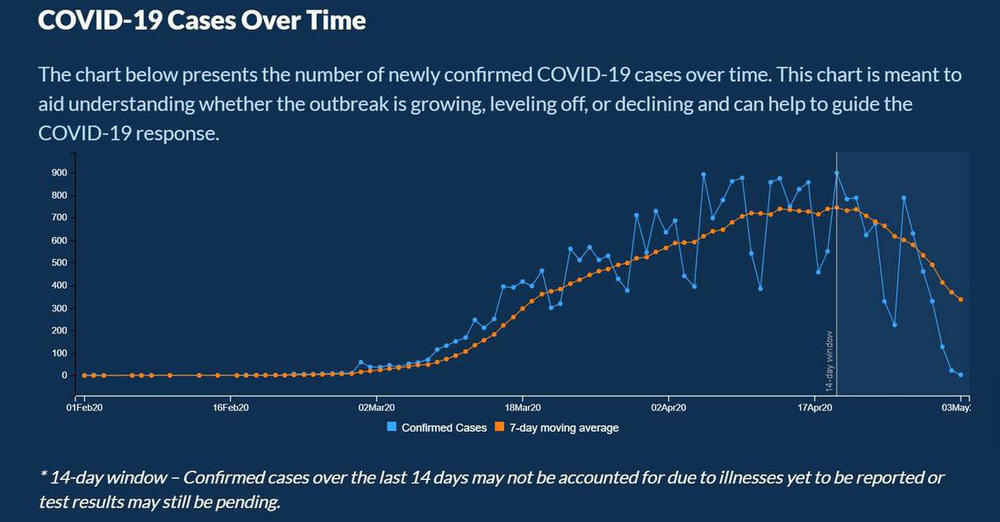
However, some of the new material has caused confusion. One trouble spot? As reported in the Macon Telegraph, a graph which if read improperly suggests infections in the state have been in steep decline, something the data do not support.
The state health department clarified the way it is counting newly confirmed cases. The measure is tied more closely to when a person begins feeling sick or when a test sample is first collected from a person.
That data, displayed on a chart on the website, may be missing cases from the past two weeks, according to DPH.
The potentially missing data results in graphs that show Georgia is seeing a sharp decline in new cases over time, although that likely isn’t happening, experts said.
Experts said the state is not clearly explaining its method of reporting new cases, and the chart showing cases over time could be misleading or confusing the public.
“They shouldn’t even put (the last two weeks) on the graph or publish them,” said TJ Muehleman, co-founder of the Standard Co., a data company that assists groups like the World Health Organization with collecting and analyzing various health data. “Any time you publish data that is subject to recasting at a later day, you are going to confuse people. That is a certainty. I’ve seen that with the state of Georgia. ...People are confused by this data.”
The new dashboard also left off data the state previously reported to the public, including the number of non-Georgia residents who tested positive for the disease and a table which listed the age and county of residence for those who’ve died.
The Georgia Department of Public Health did not respond to any of McClatchy’s questions regarding the state’s new coronavirus webpage.
But late last week, it did add missing data McClatchy asked about and said researchers were working to make sure the data reported to the public is as accurate as possible.
The concerns come as Gov. Kemp allowed various businesses to reopen despite warnings from some public health experts who aren’t convinced that Georgia has done enough to ease its coronavirus restrictions.
“I continue to believe, in spite of progress to date, that reopening businesses as the governor has begun to do is both reckless and premature,” said Dr. Harry J. Heiman, a clinical associate professor at Georgia State University’s School of Public Health.
What is new that might confuse Georgians?
In its latest update, the state health department defined how it reports newly confirmed coronavirus cases.
The department can use three different measures to help identify the date of COVID-19 cases. They are:
-
The date when symptoms first appeared.
-
The date when the first positive test sample was collected, if the date when symptoms first appeared can’t be used.
-
The date the case is reported, if the dates for symptom onset and first positive sample can’t be used.
The state health department charts these cases under its graph titled “COVID-19 Cases Over Time.”
“This chart is meant to aid understanding whether the outbreak is growing, leveling off, or declining and can help to guide the COVID-19 response,” the graph reads.
Bottom Content